The HuKeLau has been a destination in Chicopee since the 1960’s. It was originally built as a Polynesian style restaurant, bar, and performance space. The restaurant underwent numerous changes before the owners hired Thomas Douglas Architects to recreate the original Tiki décor with a modern twist. Materials such as bamboo plywood, thatch roofs and bamboo poles were used to create this themed atmosphere which is warm, playful and exuberant.
Smith College Conference Center
TDA was retained to reimagine the former faculty club as a conference center serving the campus and larger communities. Overlooking Paradise Pond, the low brick structure presented a forbidding façade toward the campus way that ran in front of it, punctuated only by a single door and a line of high, small windows.
TDA removed the original entry and replaced the front and rear walls with a glazing and a canopy, protecting the entry and providing views through the building to a rebuilt deck high above the pond. A pergola was added in front of the long wall with the small windows, creating new visual interest and warmth in an otherwise uninviting façade. The entry was made more attractive and modern with new stairs, a ramp, and plantings. Thoughtful lighting interventions were made both inside and out to create a welcoming, warm destination for visitors.
196 Pleasant Street
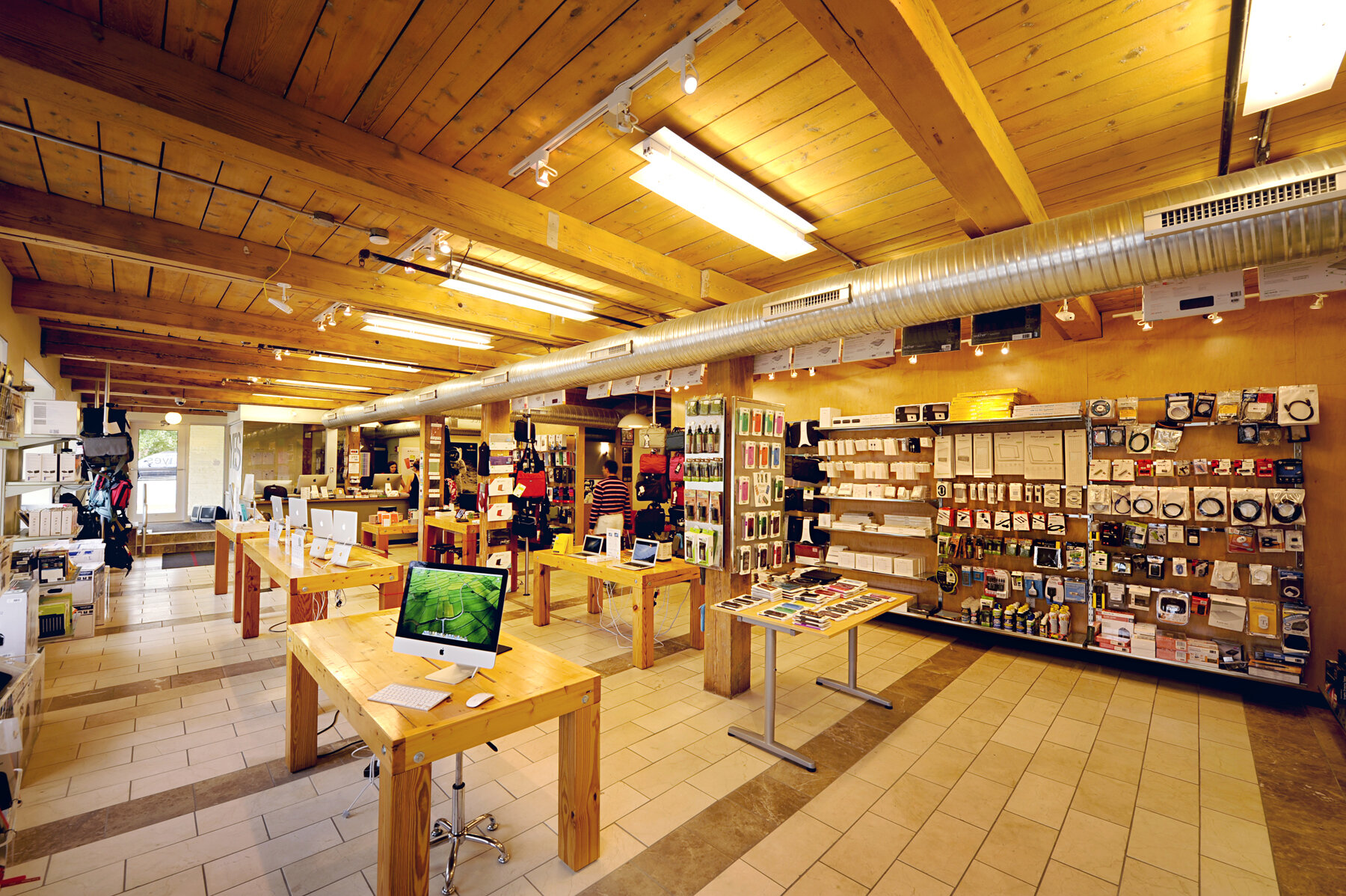
Located at the entry to Northampton’s vibrant downtown is a 1870’s brick, 12,000 square foot, 4 story, former industrial building. It was constructed for the production of specialty woven fabrics like tapes, ribbons, belts and webbings. It was purchased and renovated by Thomas Douglas Architects and Yes Computers.
Douglas Architects designed the architecture, signage, lighting and all interior spaces, including the Yes Computers retail space and three upper floor office spaces. The original timber framing and floor decks were exposed and sandblasted. The interior walls are furred-out and insulated with spray foam insulation and the brick facade is painted with long lasting and environmentally green Kiem silicate natural mineral paints. Original 3” thick factory floor decking was used to construct retail tables in Yes, further reinforcing the green and sustainable image of Yes.
The facade is lit with Color Kinetics color changing LED floodlights. Douglas Architects designed the Yes building sign which is aluminum channel letters with a double row of neon tube lights. This building welcomes visitors to the expanding downtown “shop row” of Northampton.
Smith College Gillette House
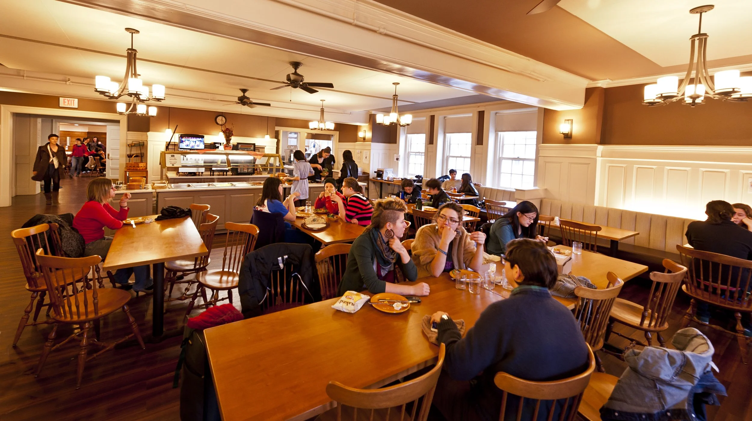
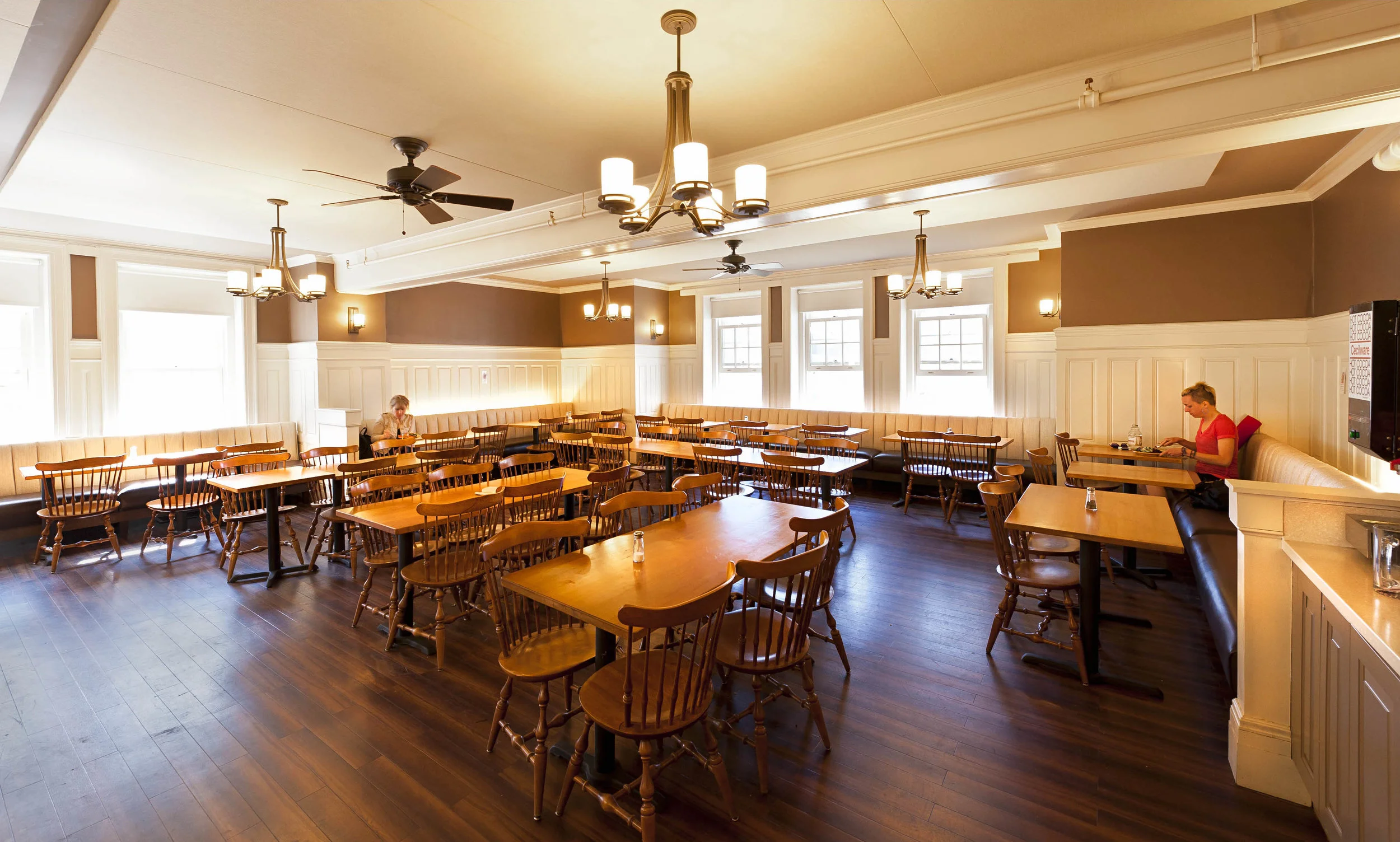
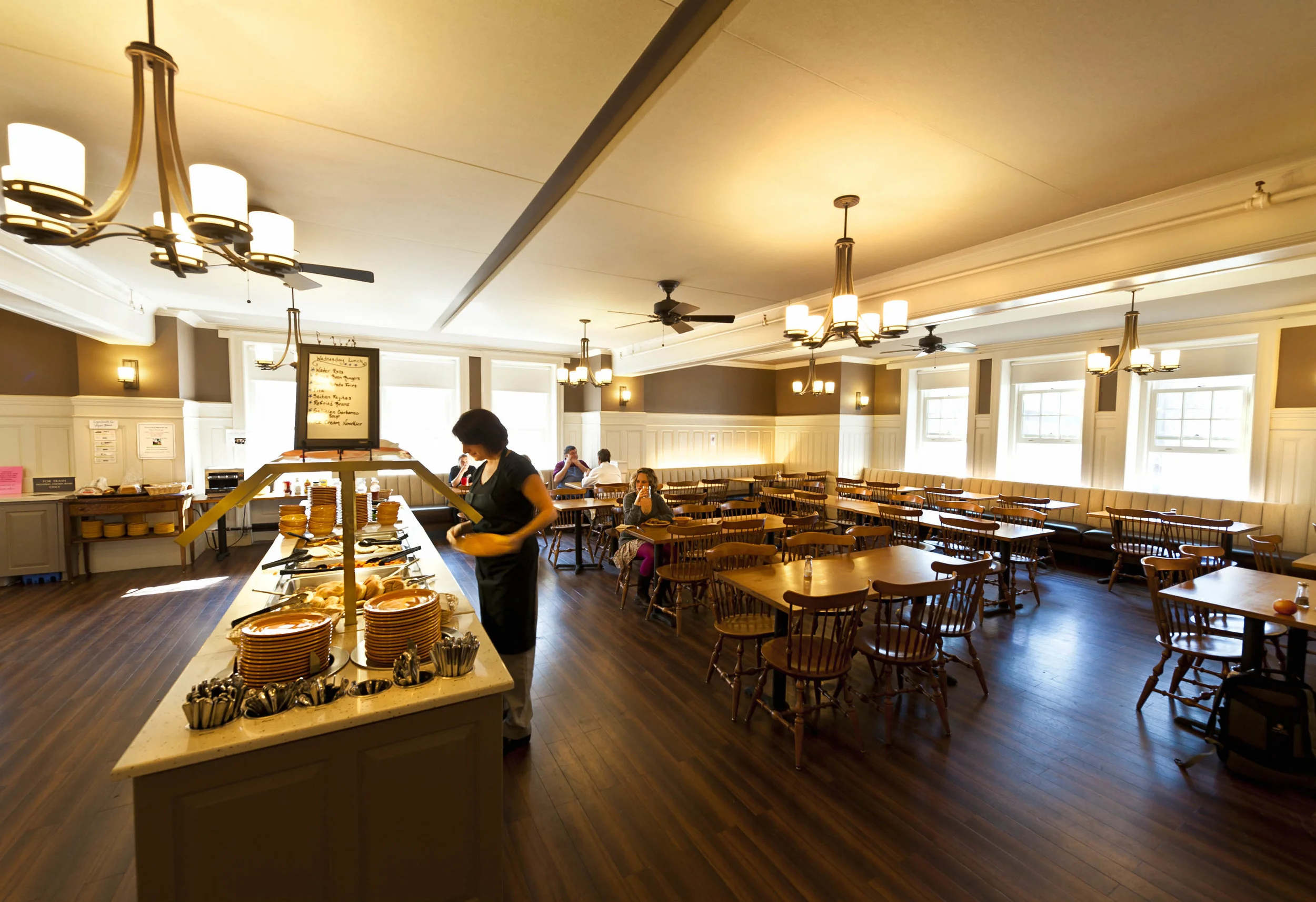
The Gillette House dining room and servery were terribly outdated. Thomas Douglas Architects worked closely with Dining Services and the students of Gillette House to design a fresh classic color scheme and to create a variety of seating options: large round tops, rectangular two-tops, and banquet seating. The serveries were also updated for this complete renovation of feeling, look, and function.
The new energy efficient light fixtures are decorative and cozy, and also define the room’s identity. Fabrics and flooring materials were chosen for their beauty and longevity in a high traffic environment. Thomas Douglas Architects has created an esthetic that is functional, esthetic and long lasting.
Johnnys Tap Room
We completely transformed this former basement space to a warm, cozy tavern. An old-world atmosphere created with the use of wood beadboard, a stone fireplace, and warm lighting reflected with stratigically placed mirrors. The large center bar can be accessed on all sides for a sense of openness and to promote social encounters. The barrel-vaulted ceiling creates visual interest and openness to the basement establishment. The space can be configured in a variety of ways to accommodate the specific needs of its clientele with a series of folding partitions and doors. Johnny’s Tap Room is functional and inviting. The perfect place for a pint or a party.
Shelburne House
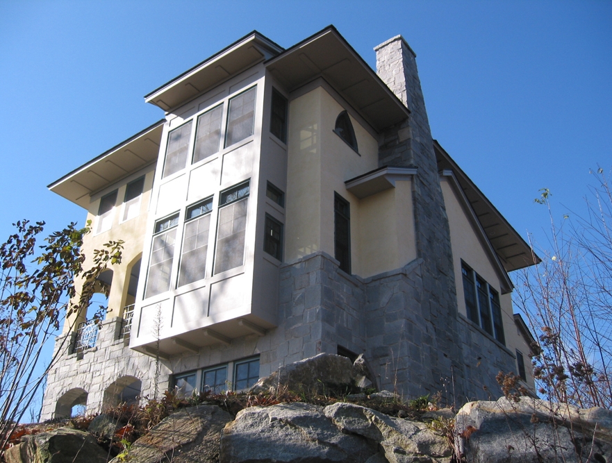
Overlooking the quaint town of Shelburne Falls, Massachusetts, this house was designed to both match and take advantage of the small mountain it was built upon. The long driveway leading up to the house offers views that suggest the house and its compact, vertical shape is an extension of the rising land beneath it. The views from this mountain are spectacular and the house was created to accentuate them with two projecting bays and an enclosed front porch that deliver you out into the landscape.
The Dennis Group
Thomas Douglas Architects worked closely with the Engineering and Architecture firm The Dennis Group to transform the interior of their 5-story 40,000 square foot historic downtown Springfield building into modern offices. Douglas Architects helped to design and coordinate all aspects of the interior including walls, ceilings, colors, materials and flooring.
Smith College Cushing House
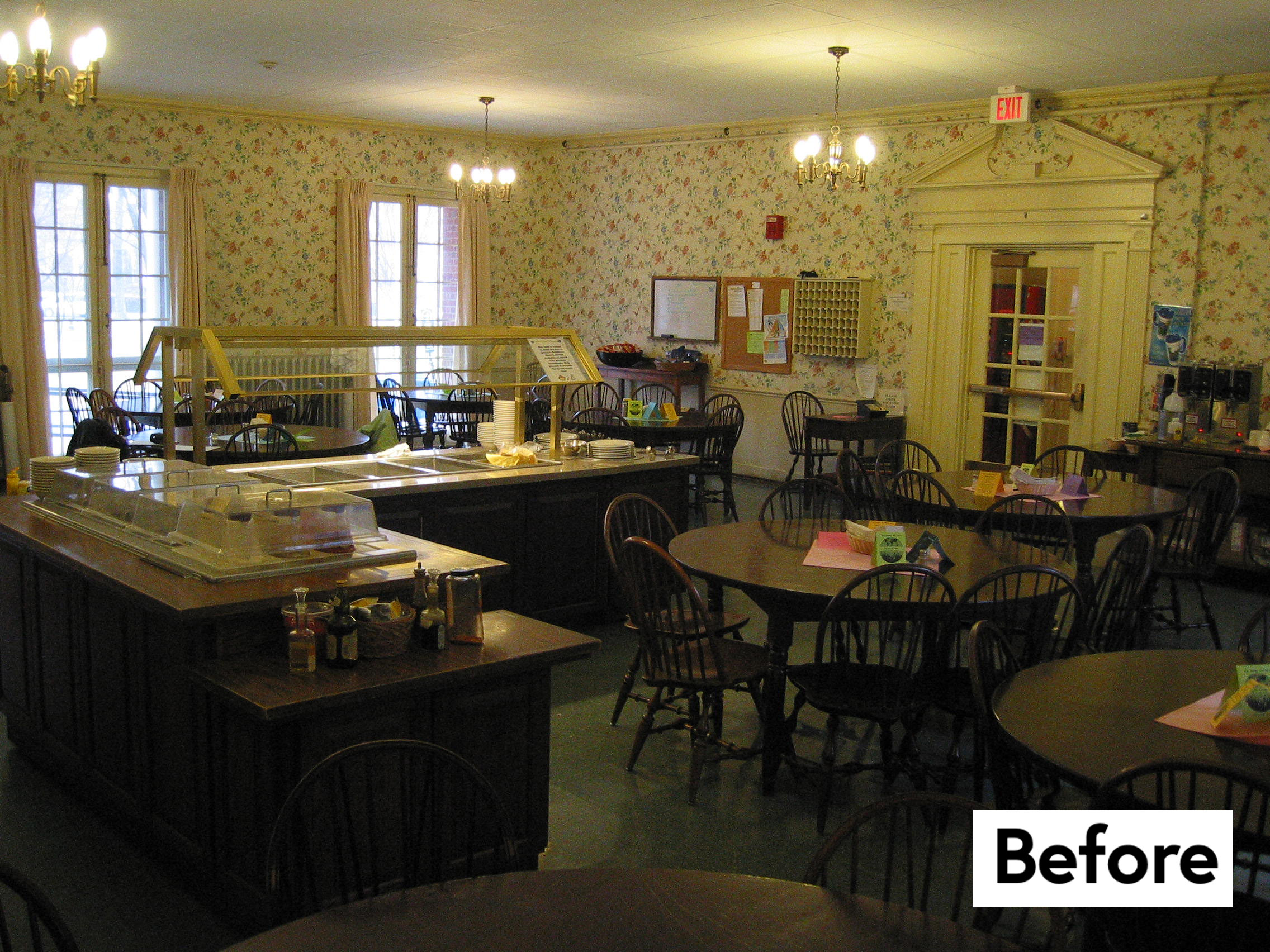
The Cushing House dining room and servery were terribly outdated. The décor was faux colonial and had the tired look of “grandma’s living room”. Thomas Douglas Architects worked closely with Dining Services and the students of the Cushing House. They opted for a fresh classic blue and cream color scheme, which we matched with cherry furniture and upholstered banquet seats. We provided a variety of seating options: large round tops, rectangular two-tops, and banquet seating. The serveries were also updated for this complete renovation of feeling, look, and function.
The new energy efficient light fixtures are decorative and cozy, and also define the room’s identity. Fabrics and flooring materials were chosen for their beauty and longevity in a high traffic environment. Thomas Douglas Architects has created an esthetic that is functional, esthetic and long lasting.
Spoleto, Northampton
Claudio Guerra’s Spoleto restaurant defined fine dining in Northampton. The renovation of this upscale restaurant in downtown Northampton encompassed an existing former bar and the addition of a new kitchen wing. The open style kitchen with its custom tiled walls and copper finishes infuses the art of creating fine cuisine with the dining experience.
The dining room design elegantly shines with mirrors and the use of metal and tile, but is contained within the enveloping subtlety of chenille fabrics, golden custom lighting, and dark cherry wood. The linear edges of the structural design play easily against the deep curves of the room’s furnishings and details.
Fire Station House
A modern urban dwelling fit into a tight lot behind existing buildings in downtown Northampton, MA, this project is a great example of the art of the possible. Perhaps the most unique house in this portfolio, this downtown Northampton home began as a one-story brick building that housed the local fire station’s alarm equipment. TDA’s design added two steel framed floors, straight up, to offer big views of downtown.
The top, of third, floor house the living room and kitchen area, the middle floor holds the bedrooms and the study. The entry shares the ground floor with parking and mechanical space.
This home is energy efficient with cellulose insulation and solar panels on the roof, uses green materials like stucco and shingles throughout, and celebrates the advantages of downtown urban living.
Forbes Library Elevator
Forbes Library, a 19th century Richardsonian Romanesque landmark in downtown Northampton, had an enclosed vestibule with an old rickety and temperamental wheelchair lift. The brief was to design a reliable, modern elevator that would fit well with the beautiful stonework of the original building and vestibule. Through an RFP process, TDA’s proposal was selected on the strength of our extensive historic preservation portfolio and our experience with sensitive interventions in adapting existing buildings to modern requirements.
The resulting design adapted a standard elevator to fit in the tight confines of the vestibule that fit well with the period of the building. Avoiding the typical materials associated with elevators, such as CMU or concrete walls, an ornamental metal “birdcage” was designed to enclose the elevator and to structurally support the elevator rails. The fourth wall is all glass, allowing light to enter from every side of the elevator and visitors to see through the cage, highlighting the artistry of the metalwork.
Deerfield House
This single-family residence is built in a secluded area on the side of a mountain in the Pioneer Valley. The one story volume is low slung, punctuated with many large windows to take advantage of the pastoral views, and designed with a modern open floor plan that allows for easy circulation and long sightlines inside as well as out. Care was taken to create a layout that would enable the owners will be able reside there for many years to come with minimal changes.
Health Communities
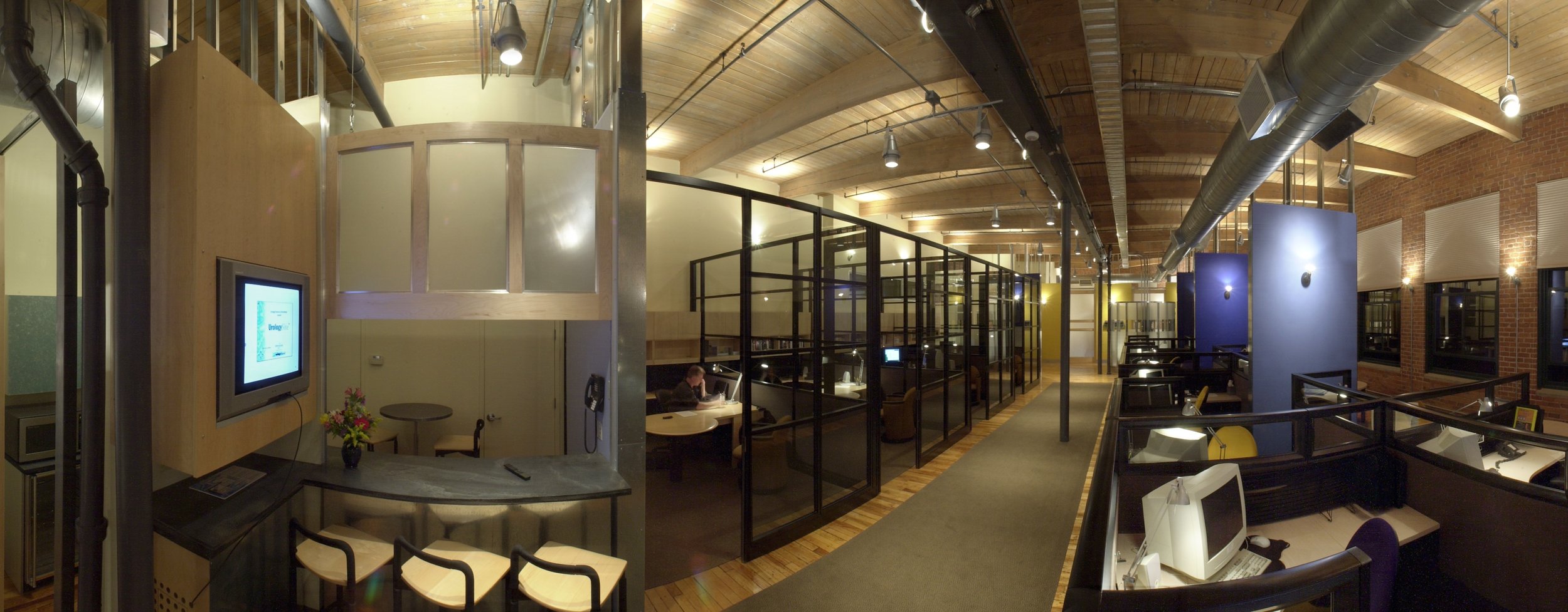
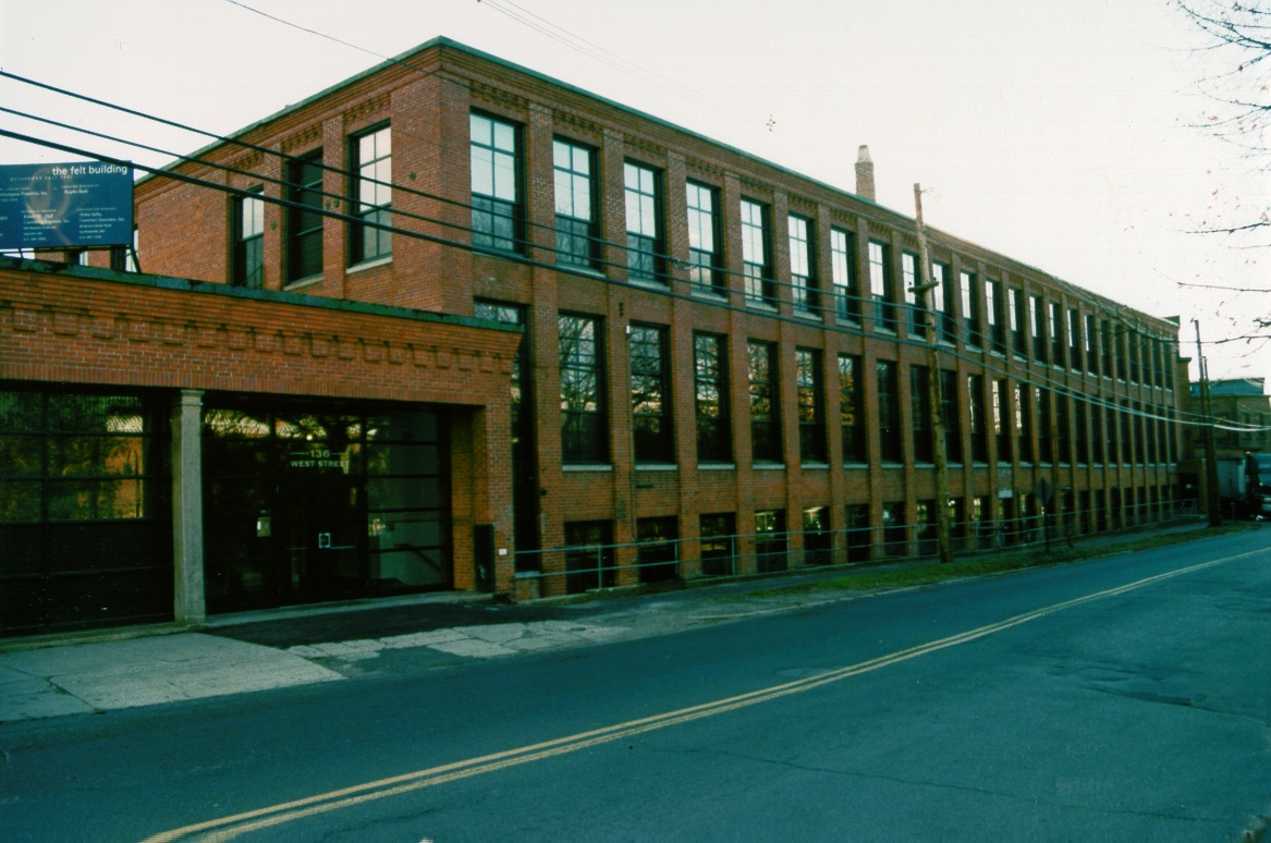
Health Communities sought to repurpose the a large space in a former mill, the National Felt building in Northampton, MA, to accommodate their high tech company. Thomas Douglas Architects gutted the 3,500 square foot structure and filled it with a modern technology feel while echoing the industrial fabric of the original space.
Exposed brick and wood beams define this space, and the use of local wood and stone further connect the new business to the historical relevance of the mill. The office features two custom conference rooms down to the details of the furniture and lighting. These spaces include integrated data sources, telephones, and computers. Modern materials and lighting combined with the industrial fabric of the ex-mill building create an open modern office.
Northampton Fire Station Restoration
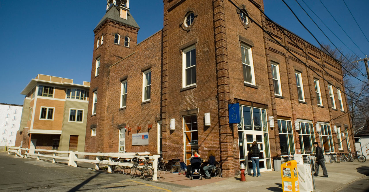
This former fire station has been a focal point for Northampton since its construction in 1872. When the city decided to build a new station and sell this “surplus structure”, the non-profit Media Education Foundation purchased it and the old building was given new life. Its new incarnation epitomized the revitalized image and feel of the downtown Northampton.
Towers became unique office spaces and garage bays became restaurant seating. The old firehouse overhead doors became the entrance to a new café on the ground floor and the floor above was turned into community, cultural and office space for the Media Education Foundation. New second floor offices were opened up to the soaring space above the old ceilings. First floor components show off the former industrial materials of the fire station structure.
The patio outside and the community spaces inside are always busy and lend new life to the downtown streetscape. The 11,000 square foot space is now more central and trafficked than ever before.
Smith College Admissions Office
This house was the former home of Smith College’s Physical Plant Director. Over the years, it was slowly transformed into offices and then became the Admissions Department, but the time came for Smith to give it a more professional and modern look, allowing new students and parents a first glimpse inside the historic college.
Thomas Douglas Architects designed a complete gut-renovation of the interior and exterior of the former house in the center of the Smith campus. The renovated first floor is used for presentations and conferences given by the Admissions Department. The space is also an actively used as a conference space for the college in general.
Smith College Emerson House
The Smith College community works hard to create a distinct personality for each of their dormitory “house” dining halls. Accordingly, we took the opportunity of this complete renovation to go straight to the students to find out what colors, fabrics and seating arrangements would work best for them.
At Emerson House the students were ready to do away with old-fashioned wallpaper and to fill their new space with warm oranges and yellows combined with the solid contrast of dark woods. Round six-top tables, rectangular two-tops and cozy banquette seating were chosen to break up the room. The energy efficient custom lighting is accented by mirrors and provides a social, homey feel.
Thomas Douglas Architects has created an aesthetic that is functional and long lasting.
South Amherst House
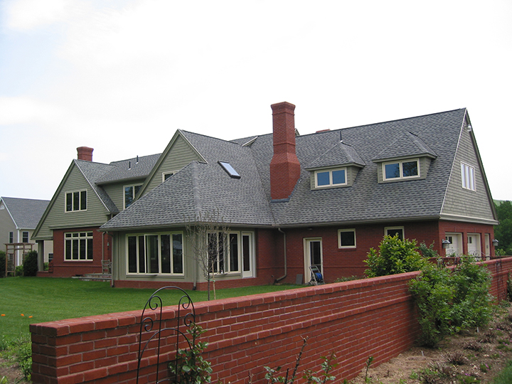
This 3,500 square foot English cottage was designed by TDA for owners in Amherst, MA. Traditional red brick and gray shingles cover the external expanse with two large sculptural chimneys form dramatic peaks. Two open porches flank the house and are framed by roof extended overhangs that create a dramatic affect.
Despite this classic English exterior, the home boasts an open modern interior. Straying from the old world predilection toward small-compartmentalized spaces, we’ve created an open connections between spaces, allowing life to flow from room to room.
Fairfield Inn
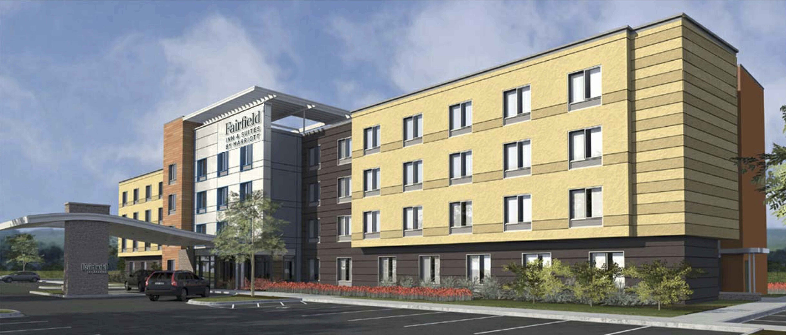
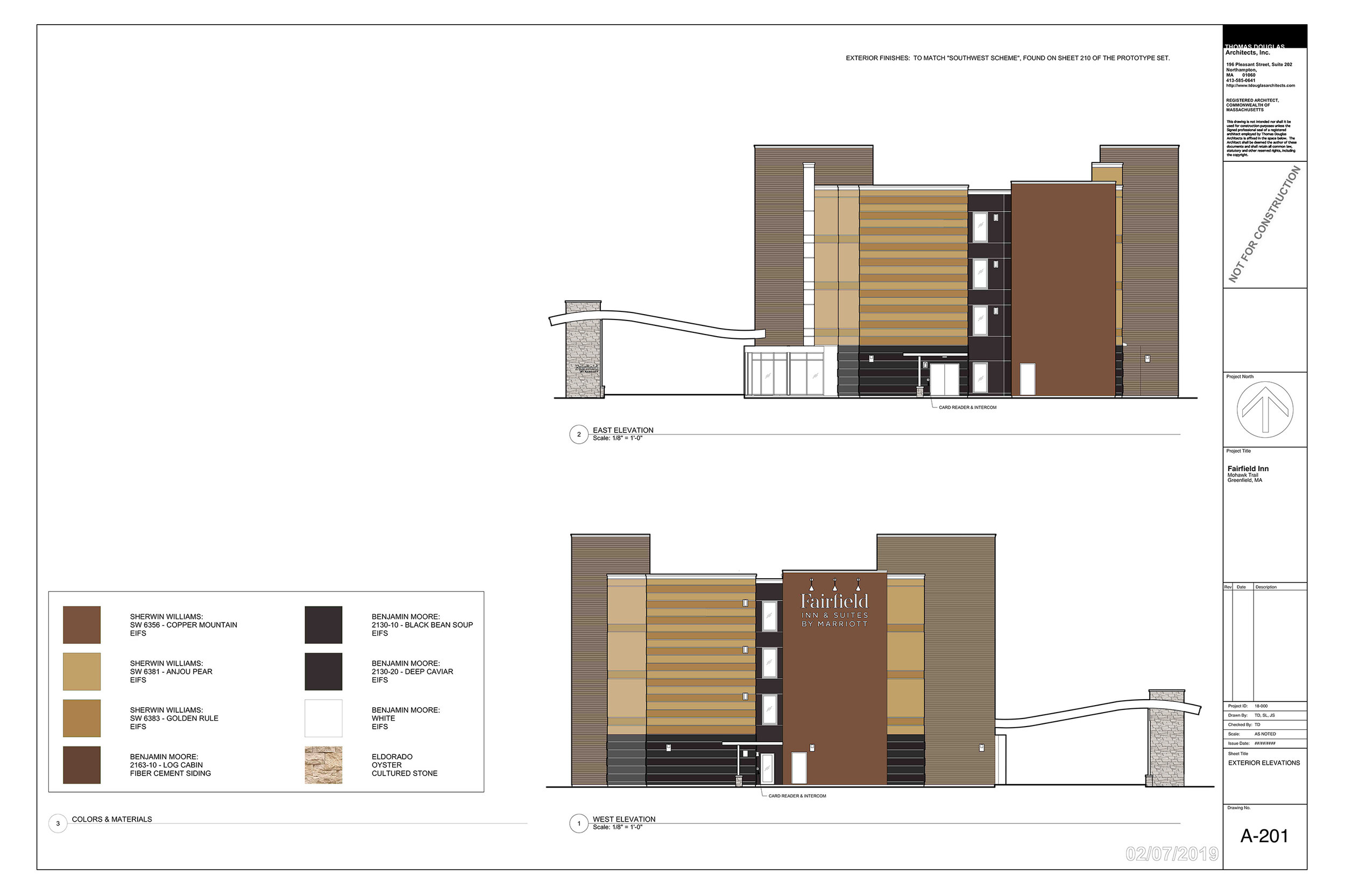
Lorem ipsum dolor sit amet, consectetur adipiscing elit. Fusce ac ligula ex. Fusce semper odio eu auctor vulputate. Sed auctor, mi eget accumsan venenatis, lectus velit hendrerit tellus, eget rhoncus nunc mauris sed massa. Nunc mollis libero nec massa interdum hendrerit. Pellentesque fermentum convallis dolor vel pretium. Aliquam sed lacinia libero. Aenean faucibus turpis enim, at aliquam dui mattis in. Fusce nisi sem, porta posuere ante quis, luctus auctor mi. Integer pharetra sapien egestas vehicula porta. Integer pellentesque semper metus vitae consequat. Mauris id arcu enim. Curabitur euismod libero nulla, vitae pharetra dolor fringilla in. Donec tincidunt purus sit amet iaculis lobortis. Phasellus ultrices semper tincidunt.
Sylvesters
The renovation of the landmark second empire style home of Sylvester Graham, the creator of the original health food craze and the Graham Cracker, included renovations to the original dining rooms, creation of a new dining room and entry porch, and a second story addition. All of the work preserves the feel of an historic home throughout the building.
The brief from the owners was to make the atmosphere of the building reflect Sylvester Graham and his famous cracker: comforting, casual, wholesome, and sweet. To accomplish this we used dark wood, light colors, and varied seating options with both a cozy café with window seating and a relaxed main dining room.
Lyman Road House
The renovations to this Queen Anne Style house premiered in the Home section of the New York Times. Originally built in the 1890’s, the house was filled with an over abundance of small rooms and dark spaces. TDA opened up the 4,000 square foot home, creating expansive living spaces with a cohesive feel and flow throughout.
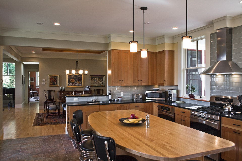
The kitchen received custom cabinetry and a separate mud room entry so that groceries and other goods could be carried directly from car to kitchen and living space. We also built a deck off the kitchen, providing and outdoor extension for eating, entertaining, and relaxing. Inhabited by a renowned writer, our renovations to this Northampton, Massachusetts home, also included extensive work to a library and study complete with custom details and built-in shelving.


